
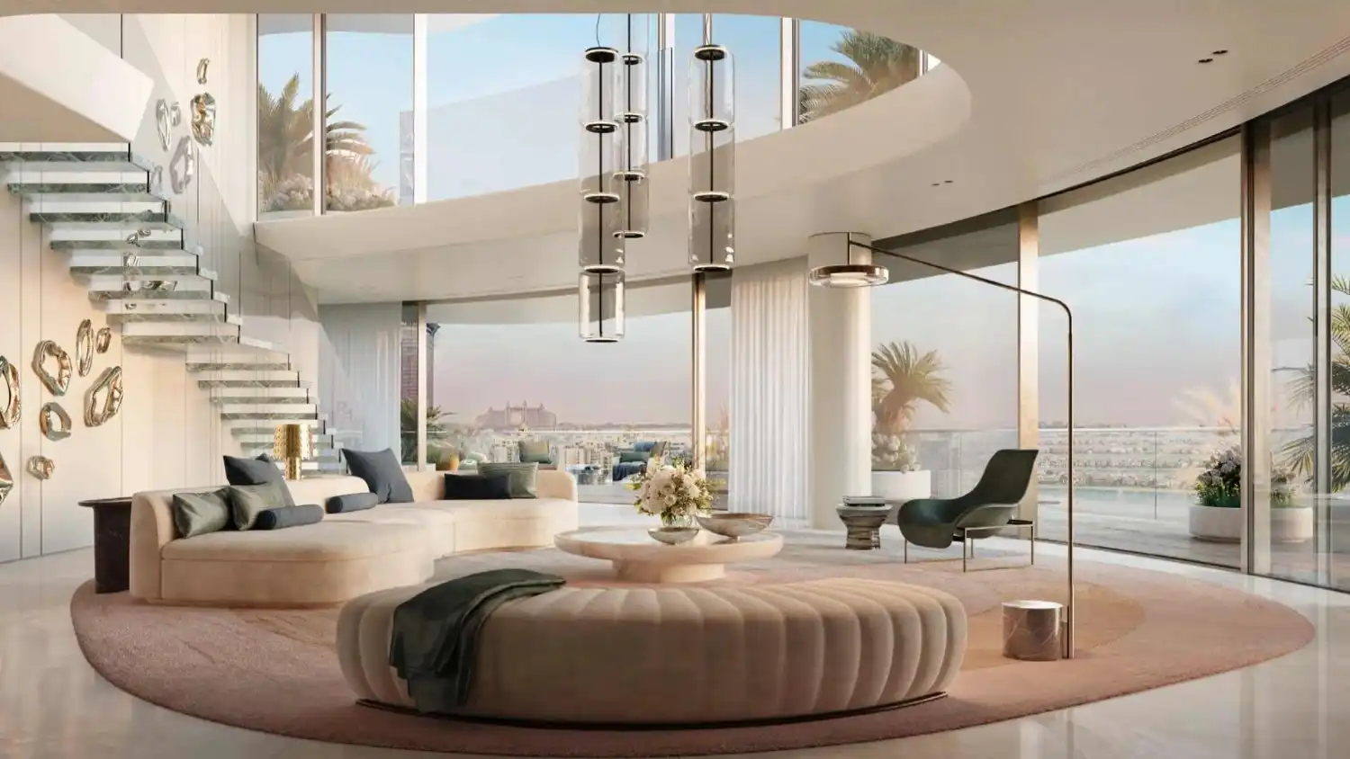
6 Ways of Home Renovation with Cohesion Scheme of Colour
Everyone loves to remodel and renovate their homes. However, without a proper colour plan, even the luxury finishes might seem out of place. The balance and the flow, and create cohesion around the house, is a little harder to achieve that way.
Cohesion in the scheme of colour ensures that each part of the home feels united, not a series of individual choices. It is important to understand that whether you are renovating one section or the entire space, carefully planning your colour selection can create a significant impact on the overall look.
In this blog post, we will discuss five simple and effective techniques for developing a united colour scheme that improves the aesthetic and the level of comfort in your home renovation.
-
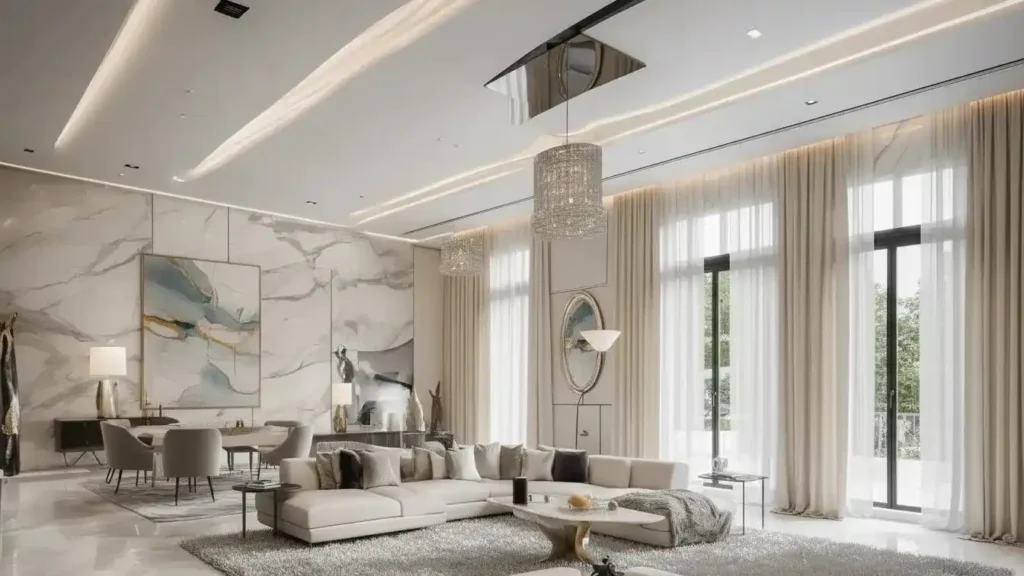
Start with a Clear Base Colour
The first cohesive colour scheme that you start with is to do with a base colour, which will provide your foundation for the entire home. There should be uniformity in the use of this colour on the main spaces in order to create a sense of continuity.
Neutral colours like warm whites, soft greys, beige or Geiger are usually the best options since they can fit in a variety of rooms and under different lighting conditions. The wall colour need not to be dominant on all the walls, but it must also be used in large numbers to bring out a feeling of unity to the entire house.
The natural lighting, the fixed features such as flooring, counter-tops and the type of mood one wants to create should be put into consideration when selecting your base colour. A good base colour enhances the easier process of applying other colours, and the space does not get torn asunder.
-
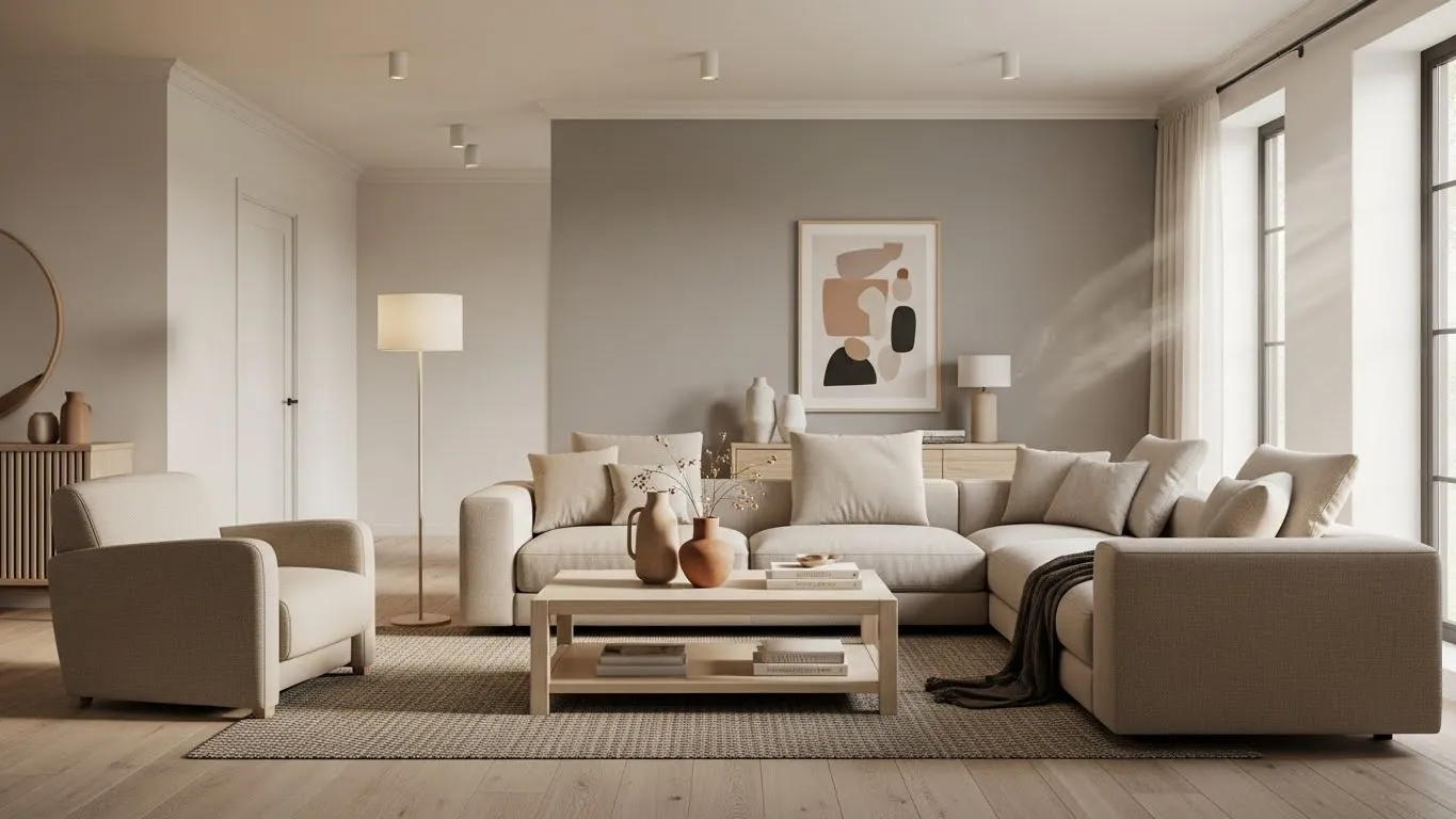
Limit Your Colour Palette
Reduction of the number of colours that you use during home renovation Dubai is one of the best methods to ensure cohesion. An excess of colour will soon overrun a room and cause it to look aesthetically cluttered. Rather, a limited colour palette of complementary tones is chosen as a way of achieving balance and harmony.
One colour with one or two more supportive colours and a subtle accent colour will help to add variation whilst maintaining the overall appearance. Applying these colours again in various rooms, either in the walls, furniture, or decor, gives a regular visual language which unites the whole house.
-
Think About Flow Between Rooms
A cohesive home will be built with transitions in consideration and not room by room. The manner in which colours shift between spaces influences a lot the sense of connectedness of your house. This is particularly notable in open plan layouts, corridors and spaces where the rooms can be seen to be visually connected.
Instead of making the colours of the surrounding spaces very different, seek gradual changes in the tones or intensity. Siblings’ shades of the same colour line enable each room to possess its own character and yet feel one with the other rooms in the house. This will enhance circulation and give the space a feeling of space and purpose.
-
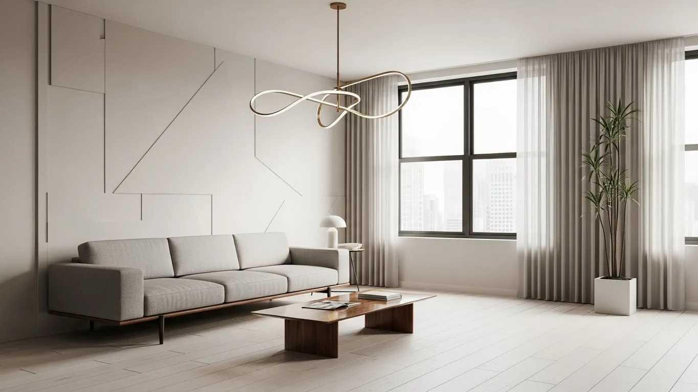
Use Accent colours purposefully
The accent colours are necessary to add personality and interest, but must be done purposefully. Unplanned accent colours may be random and unwelcome, and disrupt cohesion and make apartment renovation Dubai look unplanned. Rather, select one or two accent colours and use them in various rooms in a subtle way.
Such accents may be in furniture, paintings, feature walls and decorations. The usage of the same accent colour in the entire house gives a feeling of rhythm and familiarity, which does not clog the area, strengthening the colour scheme of the whole area.
-
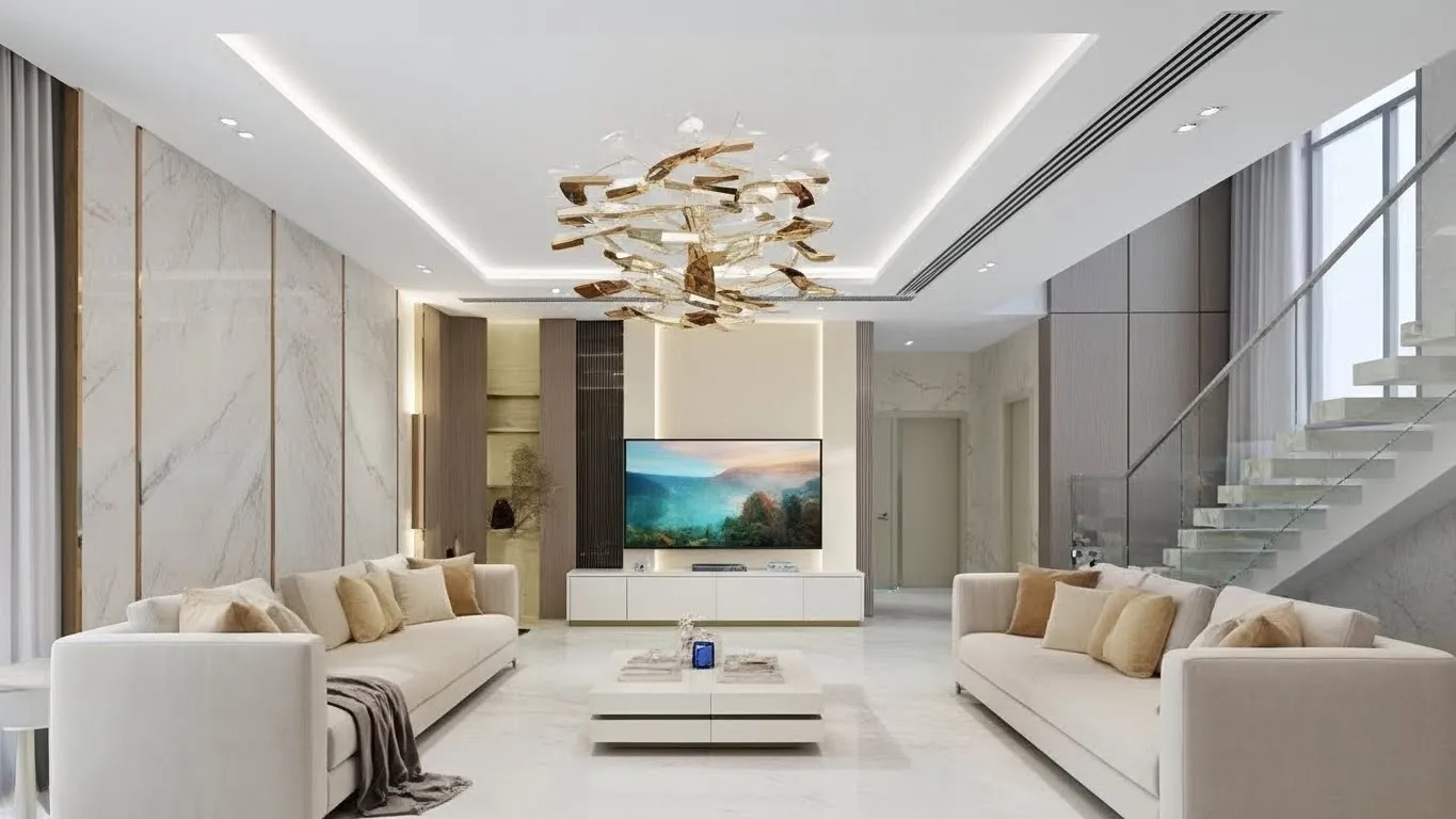
Align Materials and Textures With Colours
Materials and textures should always be taken into account together with colour choice. The perception of colours depends on wood, stone, metal, and fabric. Warm wood colours are inherently associated with earthy or neutral colour schemes, whereas cooler wooden surfaces, such as marble or concrete, can be used in combination with greys and muted colours.
It is especially important to maintain consistency in undertones. The unintentional mixing of warm and cool tones may create tension in a visual sense. This is done by making sure that your colours are consistent with the finishes and textures in your home, which results in a more quality and balanced look.
-
Test Colours Before Finalising
Lighting may have a significant transformation effect on the appearance of a colour, so testing is a very important process in any renovation. What looks great in a showroom or on a computer monitor might not seem at all like that when taken off your walls. It is advisable to test the paint samples in the real environment to determine how the colour performs during the day in both natural and artificial light.
You can see the way colours work with furniture, flooring, and decor, which will enable you to make sure decisions and prevent expensive errors. This is done to make sure that all the selected colours are in harmony with each other in the actual sense of life.
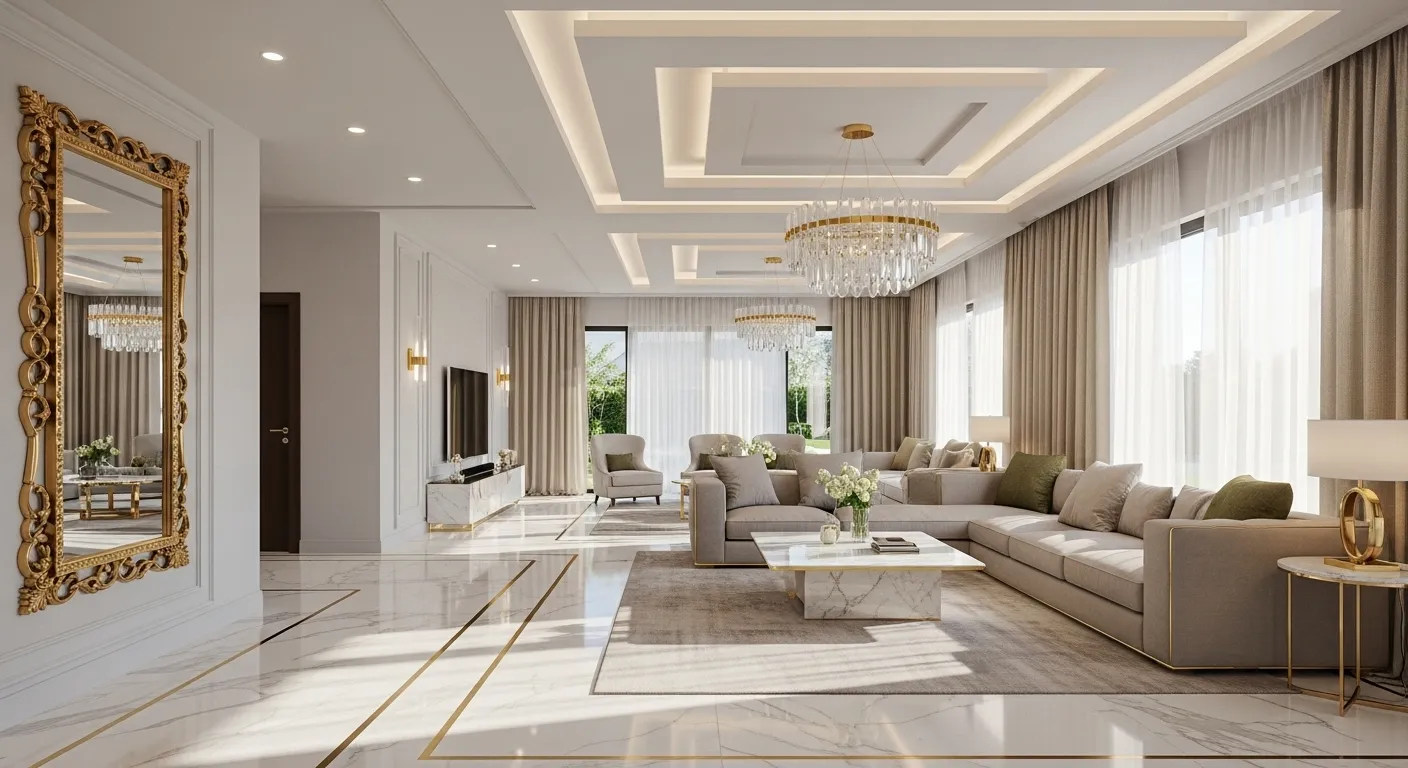
Tips and Tricks for a Unifying Colour Scheme
Although there is a carefully designed palette of colours, minor choices made when taking a renovation strengthen or weaken unity. Among the easiest, but most efficient tricks, there is the consistency of undertones. Colours might be different, yet when they belong to the same warm or cool tones, they will just go together. The combination of warm and cool colours without any deliberate effect tends to create a space which will seem aesthetically disproportionate, despite individually good-looking colours.
The repetition of colours in various surfaces and materials instead of them being used in a single place is another helpful strategy. Still, as a case in point, a colour that was used on a feature wall can be reflected in cushions, rugs, artwork, or even in minor elements such as trim or cabinets. This repetition is useful so that the eye flows effortlessly through the space and further gives weight to the whole colour narrative of the home.
The colour perception largely depends on the lighting system, therefore, it is necessary to test your colours in the same light conditions they will be used in to understand the way they will be perceived. Natural daylight, warm lighting, and cool LED lighting have different interactions with the paint and finishes. It is always good to test your samples at different times of the day so that you will be assured that your colours will be alright despite the fluctuating light.
It can also be useful to reason in terms of colour families and not of the exact matching. Light and dark colour would be used in the same colour in the whole of your house giving it depth as well as harmony. The method works especially well at linking open spaces or other rooms together without causing them to become monotonous.
Lastly, avoiding time wastage through recording your colour palette can save you a lot of time, and help avoid inconsistent renovation process. Maintaining a basic reference sheet of names of paints, finishes and material samples makes sure that all those involved, contractors as well as suppliers are operating according to the same plan. This minimizes the likelihood of little to no corresponding tone or unexpected changes which may interfere with the unit of your design.
With the help of these tips and tricks, not only the visual cohesion of the home renovation is achieved, but also a home that is purposeful, well-balanced, and designed in a professional manner is created.
Conclusion
The key to a successful home renovation is a cohesive colour scheme. It introduces simplicity, smoothness and longevity to your home. A well-coordinated and designed home can be achieved by building a good foundation, base colour, restricting your palette, planning transitions in the room, exercising great caution with your accents, matching colours and materials, and testing yourself before laying down the brush.
Colour does not simply go down to aesthetics; it determines the feel of a home. Through proper planning and deliberate decisions, there is a way to have your renovation look timeless and unified yet welcoming years later.